
Wayfair
The Wayfair website redesign project focuses on improving user experience by addressing existing design issues and enhancing visual engagement. The goal is to create a more structured layout using variations in size, color, and style to improve clarity. By refining the visual hierarchy and highlighting key elements, the redesign aims to deliver a user-centric, aesthetically pleasing platform that ensures a seamless and enjoyable online shopping experience.
Focus:
UI/UX
Tools:
Adobe XD | Adobe Photoshop

Project Overview
The Wayfair website redesign project focuses on enhancing the user experience by addressing key design challenges. The primary objective is to improve visual hierarchy, which currently results in overwhelming and uniform product displays. The redesign aims to create a more structured and user-friendly layout by employing variations in size, color, and style to provide better clarity. Another key improvement involves optimizing the visibility of customer reviews, which are currently hidden in a small box. By making these reviews easier to access, the project seeks to provide users with valuable feedback while streamlining navigation and enhancing the overall usability of the shopping platform.
The target audience for this redesign includes individuals and households interested in home furnishings, ranging from design enthusiasts to customers seeking affordable and stylish options. Through a more engaging and informative design strategy, the project aims to cater to diverse demographic groups who value convenience and an easy online shopping experience. By implementing a refined visual hierarchy and improving access to essential information, the project will create a seamless and visually appealing platform. This redesign will position Wayfair more competitively against rivals like Amazon Home, IKEA, and Overstock, emphasizing a user-centric approach that prioritizes both aesthetics and functionality.
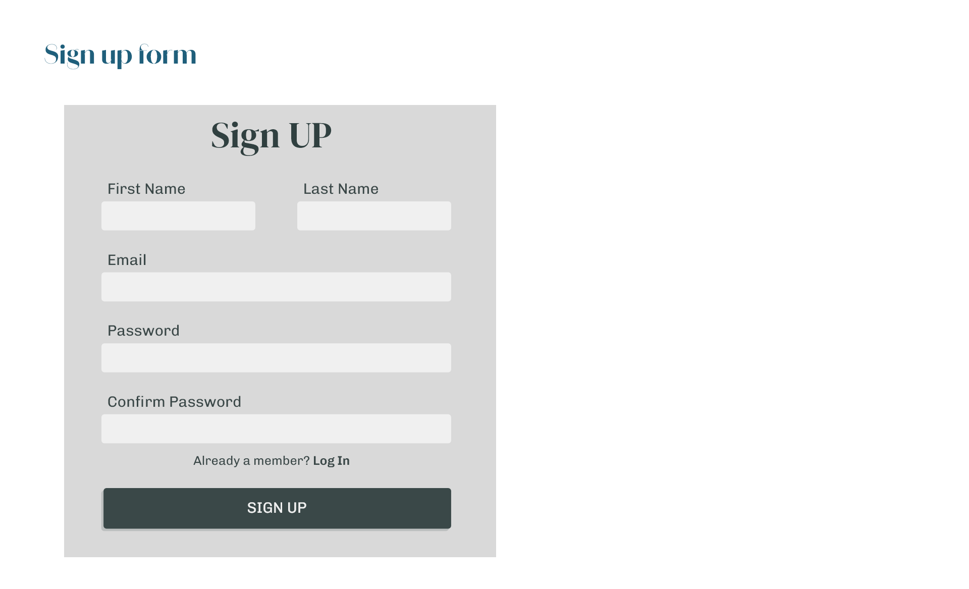
Style Guide

UI Component


Final Design


Challenges
- Organizing overwhelming product displays for better clarity.
- Improving review visibility without disrupting the layout.
- Balancing visual appeal with user-friendly navigation.
- Designing for both experienced and first-time online shoppers.
- Maintaining uniform typography and design across the platform.
Outcome
- Learned how to create a clear visual hierarchy to make product displays easier to navigate.
- Gained experience in optimizing designs to meet diverse user needs and improve accessibility.
- Learned to balance aesthetics and functionality for a seamless user experience.
- Developed skills in identifying and addressing design issues like hidden information and cluttered layouts.
- Recognized the importance of maintaining consistent typography, colors, and design components across the platform.


